Calming nursery colour palettes — and how to build your own
Calm doesn’t come from a particular colour. It comes from low contrast and low saturation — colours that sit close to each other in tone, none of them shouting. Once you know that, building a palette becomes a set of rules rather than a matter of taste.
Why muted colours read as calm
Strong, saturated colours demand attention; the eye keeps jumping between them and the room never quite settles. Muted colours — anything you’d describe as dusty, greyish, faded or earthy — sit closer together in brightness, so the whole room reads as one surface. That’s the effect you’re buying when you choose a soft sage over a bright green.
The 60/30/10 rule
Almost every nursery that looks professionally done follows this simple split:
- 60% — the base. Walls and the largest surface. Warm off-white, cream, oatmeal, pale clay. Keep this one quiet.
- 30% — the second colour. Curtains, rug, bedding, and usually the dominant colour in your artwork. This is where the personality lives.
- 10% — the accent. A cushion, a lamp, one plant pot, the brightest note in a print. Small, and used in only two or three places.
The most common mistake is inverting this — a strongly coloured wall plus strongly coloured everything else. The room stops being restful and starts being loud.
If you already have a bold wall: don’t fight it, starve it. Keep everything else in the 60% and 30% categories quiet, and let art carry thin slivers of the wall colour. Wall colour plus neutral art almost always works; wall colour plus competing saturated art almost never does.
Five palettes you can copy
1. Sage and oat
Walls: warm oat #EFE9DE · Second: soft sage #7C8B74 · Accent: terracotta #B04A3A. Earthy and gender-neutral; this is the palette most likely to still suit the room in five years.
2. Dusty rose and clay
Walls: pale clay #F3E7DF · Second: dusty rose #D6A9A2 · Accent: deep olive #5E6B52. Warm without being sweet, and it photographs beautifully.
3. Ink blue and cream
Walls: cream #F7F3EC · Second: soft navy #3B4A5A · Accent: brushed brass or ochre #C08A3E. A little more contrast than the others — good for a room that gets a lot of daylight.
4. Warm grey and blush
Walls: warm grey #E7E3DC · Second: putty grey #A9A398 · Accent: blush #E4C4C0. The quietest palette here. Ideal if the room is small and you want it to feel bigger.
5. Ochre and forest
Walls: sand #F0E6D2 · Second: forest #43503F · Accent: ochre #D89B3A. The boldest option — use the ochre sparingly, in one cushion and one detail in the art.
How to pick art that matches
You don’t need art in exactly your wall colour. In fact, art that matches too precisely tends to disappear. What you want is art that:
- Shares one colour with the room, usually the 30% second colour. One shared colour is enough to make it feel related.
- Stays lower in saturation than the wall. If the wall is already soft, the art should be soft too, or it becomes the loudest thing in the room.
- Uses a lot of neutral space. Art with generous empty space acts like breathing room on a busy wall.
- Comes as a coordinated set. Six prints from one set will always beat six prints chosen one at a time — they share a palette by design.
Three fast rules that prevent clashes
- One accent, two places. If your accent colour already appears on a cushion and a lamp, don’t add a third strong object.
- Match the frame to the room, not the art. In a warm room, natural wood or warm black; in a cool room, black or white. Identical frames across a group always look more considered than mixed ones.
- Test in daylight. Colours shift dramatically between a bright window and a warm evening lamp. Look at your palette at both ends of the day before committing to a wall colour.
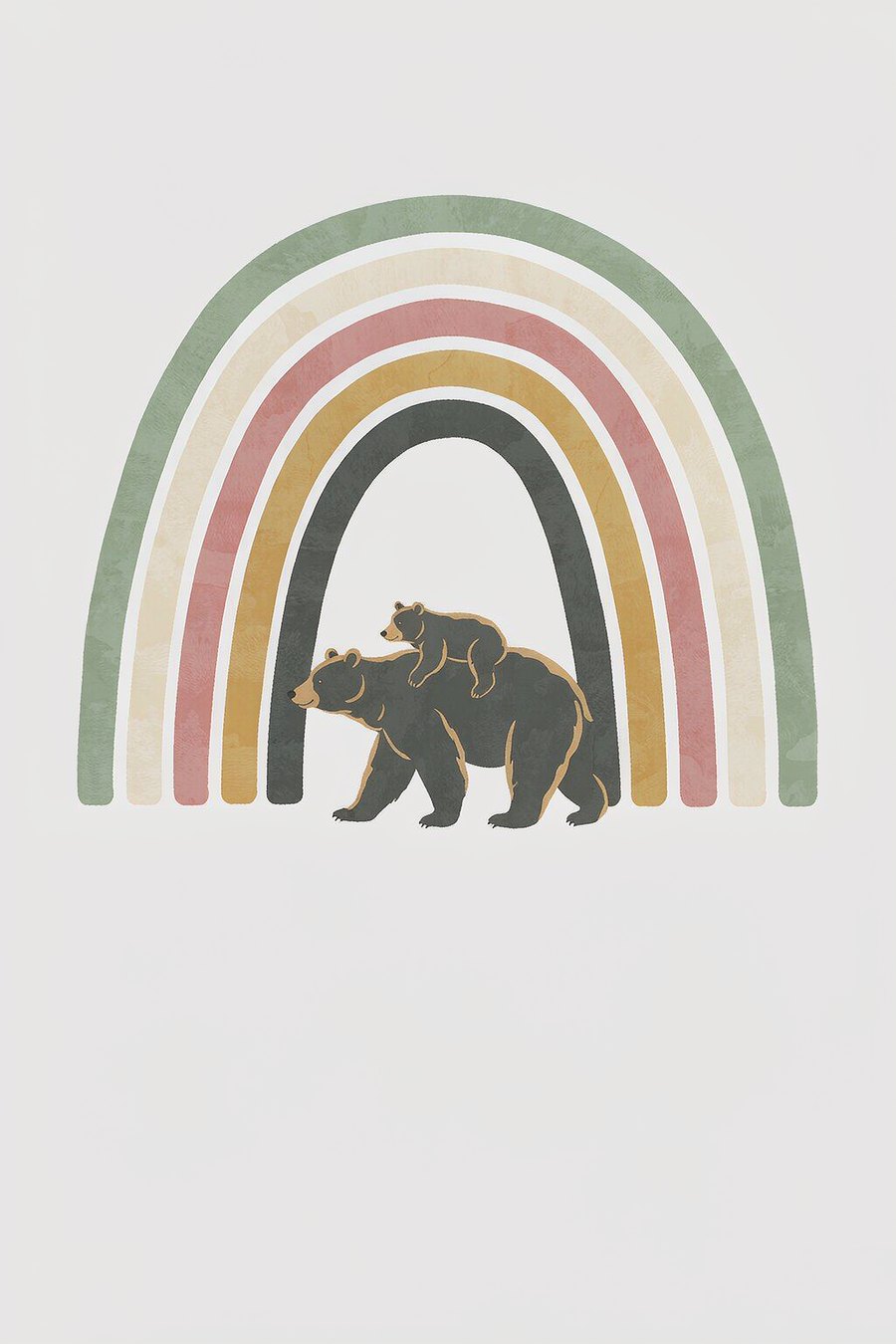
Little Calm is built on exactly this principle: six prints sharing one muted palette — sage, cream, dusty rose and soft ochre — so the set matches any of the palettes above without competing with your wall.
Get Little Calm — $19.99