Nursery gallery wall layouts that always work
A gallery wall is just a group of frames treated as one object. Get the spacing and the outer shape right and almost any combination of prints will look deliberate. Get them wrong and even beautiful art looks like a mistake.
The two rules behind every good layout
Rule one: the group should form a shape you can describe. A rectangle, a square, a straight line. If you can’t name the outer shape of your group, it will read as a scattering rather than a composition.
Rule two: the gaps are the design. Keep the space between frames consistent, and keep it smaller than the space around the group. A common formula: gaps inside the group of about 5–8 cm, and at least 15–20 cm of clear wall around the whole thing.
Layout 1 — the straight row (easiest)
Three or four same-size frames in one horizontal line, centred over a piece of furniture. Measure once from the floor to the centre of the first frame, then repeat that height for every other frame — don’t measure from the ceiling, which is almost never level.
Works with: three prints from one set, identical frames, identical size. This is the layout to choose if you only want to drill holes once.
Layout 2 — the 2×2 grid
Four prints in a square block. Because the outer shape is a square, it reads as a single object from across the room, which makes it ideal for small or awkward walls where a row would be too wide. All four prints should be the same size and orientation.
Layout 3 — the 2×3 rectangle
Six prints in two rows of three — the natural home for a six-print set. It fills a wall of average width without the art becoming gigantic, and it stays balanced if you later remove one print (four in a tidy rectangle still works).
Layout 4 — the centred column
One print, then another directly below it, then a third. This is the layout for narrow wall strips — beside a door, between a window and a corner — where anything wider than about 40 cm would feel cramped. Use landscape or portrait consistently; mixing them breaks the column.
Layout 5 — the deliberate asymmetry
One large print with two smaller ones grouped to one side, or a row of three where the middle frame is larger. This is the only layout on this list that requires a bit of judgement: the rule is that the total visual weight on each side of the centre line should feel roughly equal. Big-on-the-left needs two smalls on the right. If it feels unbalanced after taping it up, it is — trust that instinct.
The paper-tape trick (do this before you drill)
- Cut paper to the exact size of each frame, then cut a second set to the size of the artwork inside the frame (so you can see how the print will actually look).
- Tape them to the wall, using painter’s tape so you don’t damage the paint.
- Step back to the doorway. Take a photo.
- Leave it for a day. Look at it again in the morning.
Nearly every layout problem — too small, too high, too cramped — is obvious within one minute of doing this, and completely invisible when you’re holding a drill.
Five mistakes to avoid
- Hanging too high. The single most common error. Centre the art at roughly 135–150 cm from the floor in a nursery, not 170 cm.
- Mixing frame colours in one group. Identical frames, varied art — never the reverse.
- Spacing unevenly. Eyeballing gaps fails. Measure the gap once, then use it everywhere.
- Crowding the ceiling. Leave more empty wall above the group than below it; a group pinned to the ceiling looks squeezed.
- Hanging anything heavy above the crib. Cots get climbed and children throw. Keep glass and heavy frames away from the sleep area, and use proper wall anchors for everything else.
Frames: the shortcut that saves the most work
If you’re building a group, the cheapest route to a professional result is: buy one style of frame in one or two sizes, and print the artwork to fit. A printable set with multiple aspect ratios means the artwork adapts to the frames — instead of you hunting for art in five specific sizes.
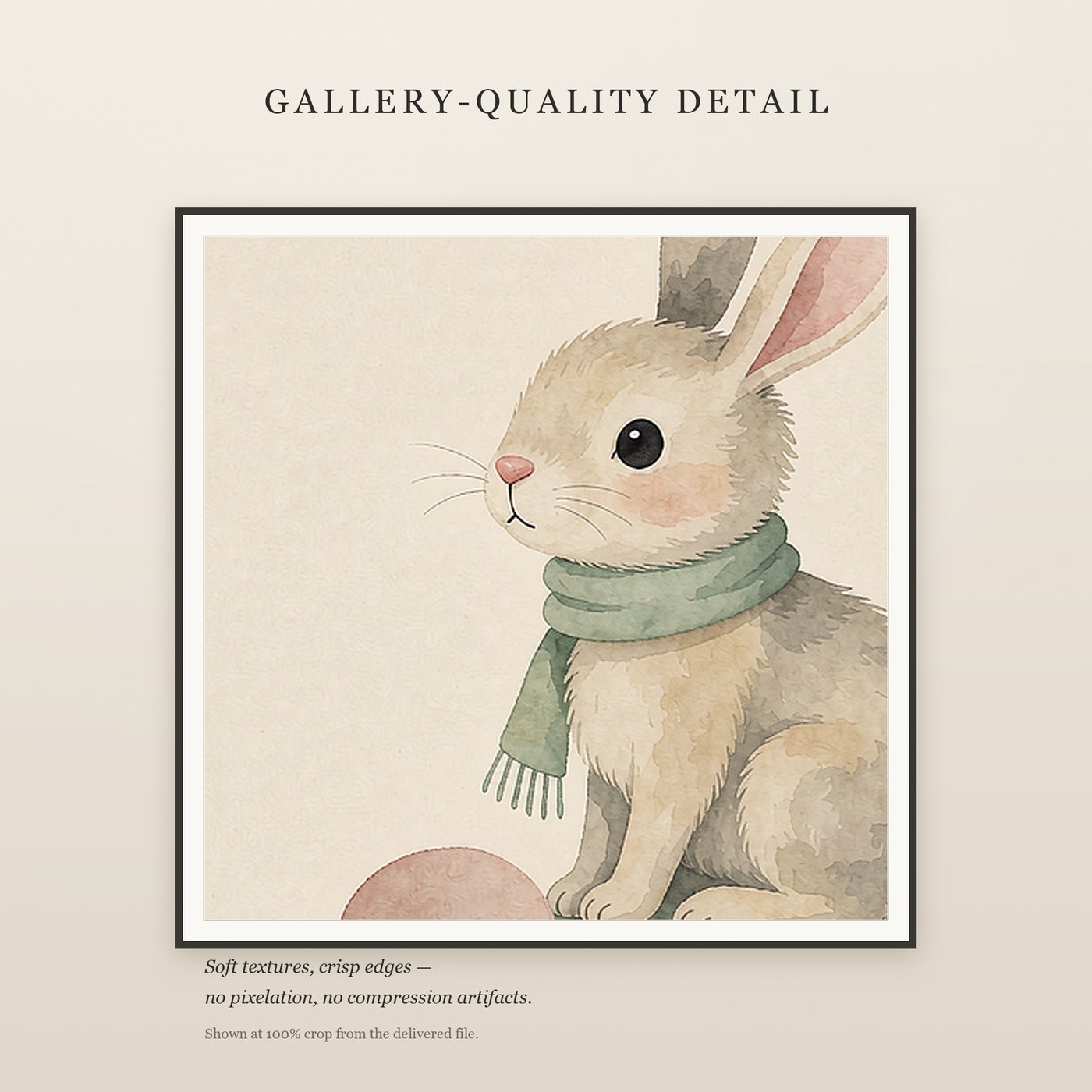
Little Calm — six coordinated nursery prints, each supplied in five aspect ratios (2:3, 3:4, 4:5, 11x14, ISO A) at 300 DPI. Enough for a 2×3 gallery wall, or three separate rows.
Get Little Calm — $19.99